HungerBox App
HungerBox App
a million meals and one massive turnaround
a million meals and one massive turnaround
The Brief
The Brief
Transforming HungerBox’s aging cafeteria app into a trustworthy, intuitive experience that could scale to 6 lakh+ daily orders.
Transforming HungerBox’s aging cafeteria app into a trustworthy, intuitive experience that could scale to 6 lakh+ daily orders.
The Challenge
The Challenge
Redesign into a reliable, scalable product - while balancing legacy tech, fragmented user journeys and pandemic disruptions
Redesign into a reliable, scalable product - while balancing legacy tech, fragmented user journeys and pandemic disruptions
The Impact
The Impact
Raised the app rating from 2.3 to 4.2, improved trust and adoption, and set the foundation for a scalable B2C platform used across India’s largest enterprises.
Raised the app rating from 2.3 to 4.2, improved trust and adoption, and set the foundation for a scalable B2C platform used across India’s largest enterprises.
A Product Stuck in Survival Mode
A Product Stuck in Survival Mode
When I joined HungerBox in late 2019, the consumer app had already been in the wild for three years. It did its job: let users order food in corporate cafeterias. But design? Almost nonexistent.
The App Store rating was 2.7. Reviews were blunt:
“Confusing.”
“Slow and buggy.”
“Feels like it doesn’t care about users.”
The irony? By then HungerBox was a market leader, powering cafeterias for some of India’s biggest enterprises. But the app - the face of our business for millions of employees - told a different story: clunky, inconsistent, and indifferent.

frustrating, inconsistent app with poor rating
The Credibility
Gap
The Credibility
Gap
Corporate clients loved our backend systems. Admins got dashboards. Vendors got POS terminals. But for users, the app was the weakest link.
Orders lacked clarity - one “ready/delivered” status for everything.
No proactive communication - users had to refresh endlessly.
Feedback was a black hole - no structured way to report issues.
The brand? Still stuck in old orange, uninspired screens.
If HungerBox wanted to scale as a B2C facing product,
If HungerBox wanted to scale as a B2C facing product,
the app had to Grow Up!
the app had to Grow Up!
Research: Understanding Users at Scale
Research: Understanding Users at Scale
We leaned on three pillars:
Mixpanel analytics → mapped funnel drop-offs, saw users abandoning mid-order when status updates lagged.
App reviews analysis → mined 10k+ comments for recurring pain themes.
User interviews → shadowed office-goers placing orders during peak lunch hours.
One story stood out:
A user showed me how she kept refreshing the app every few minutes, anxious about whether her food was ready.
“I don’t mind waiting. I mind not knowing.”
That became our north star: reduce anxiety, increase trust.

bifurcation of voluntary vs mandatory feedback

bucketing on the bases of feedback types
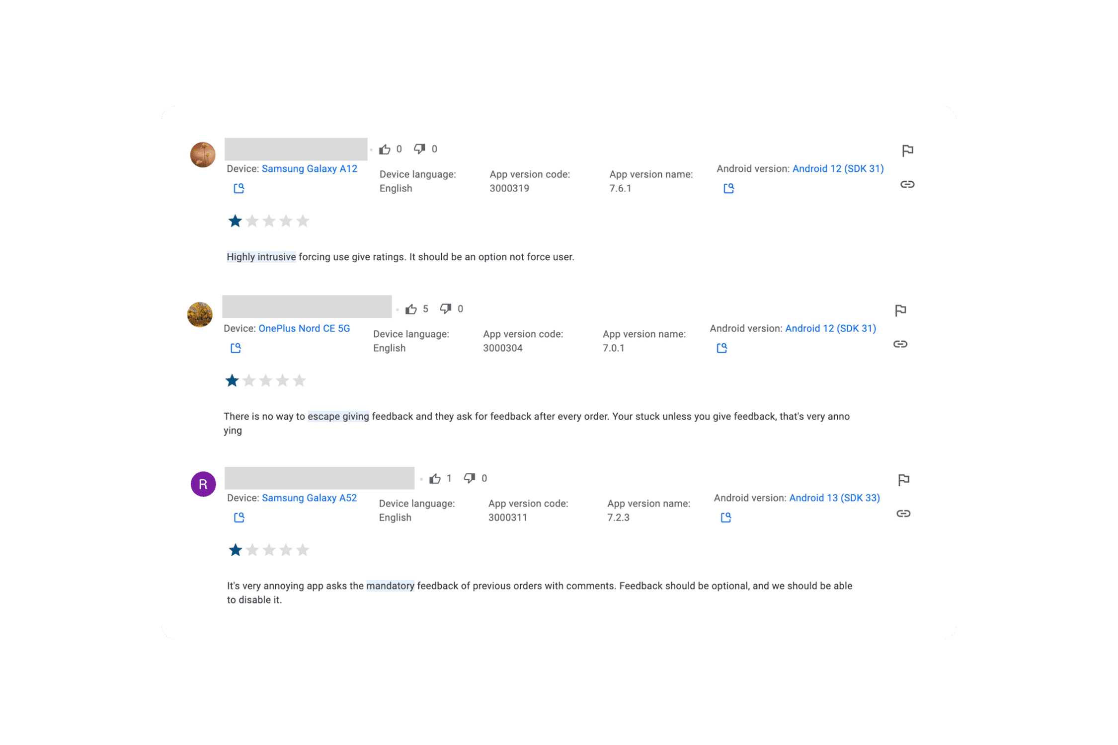
poor reviews on mandatory feedback were degrading play store rating
Act 1:
The Purple Revolution
Act 1:
The Purple Revolution
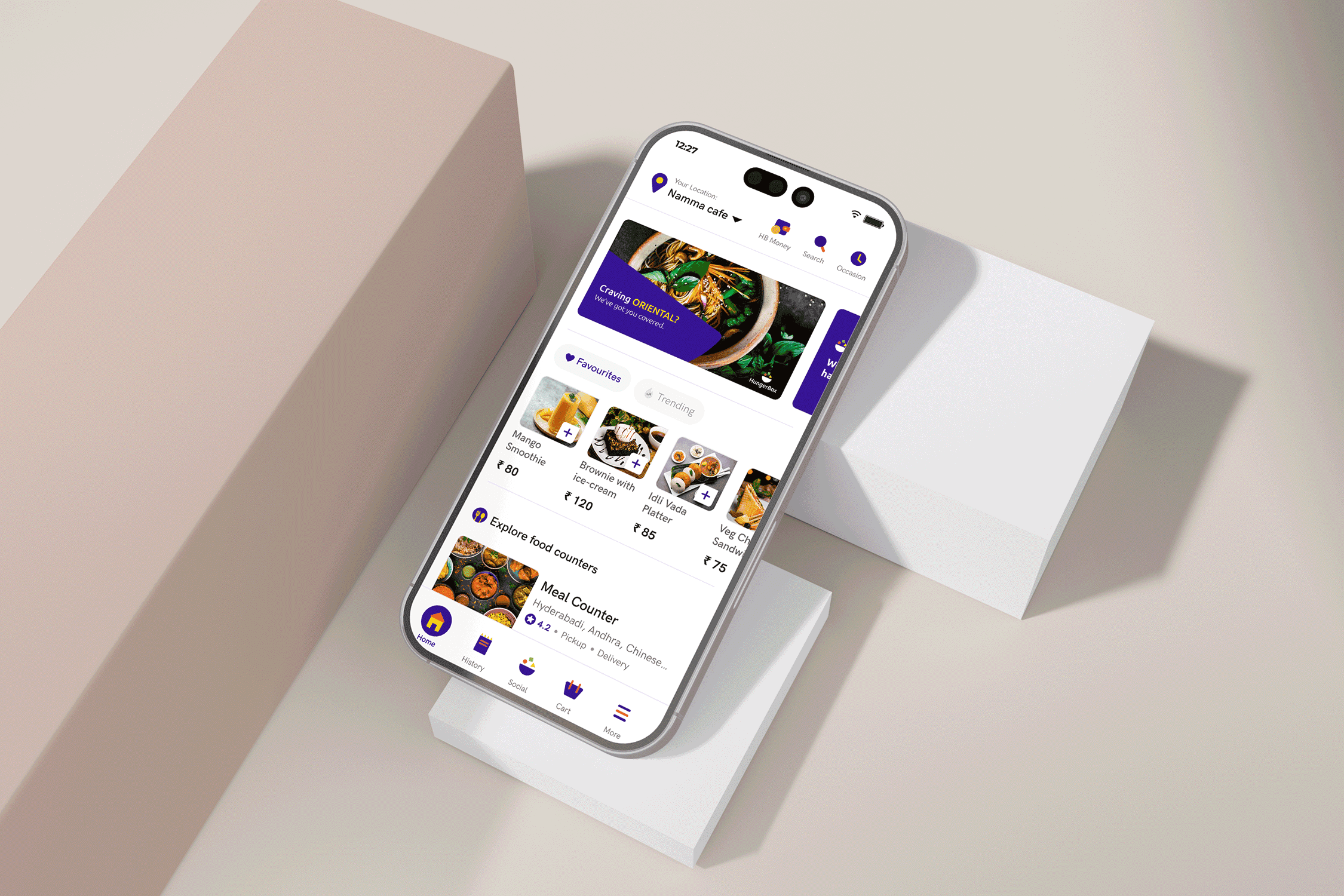
With HungerBox stepping into a new brand identity, I led the rebranding of the entire consumer app - aligning design with the new, bold visual language.
Collaborating closely with marketing, engineering, and product, I translated the brand ethos into UI decisions that elevated user perception and confidence.
No new features, but users suddenly felt something had changed. The experience was cleaner, clearer, and far more cohesive. Trust followed. So did re-engagement.
philosophy behind HungerBox logo

the revolution from orange to purple
Act 2:
UX for Real Life
Act 2:
UX for Real Life
This wasn’t just about pushing pixels. It was about solving cafeteria-specific pain points:
Item-Level Order Tracking
Previously, the app lumped orders into one block. Users had no idea which items were ready. We redesigned it so each item had its own status - accepted, cooking, ready, or canceled.
Push Notifications
We stopped forcing users to refresh. Instead, the app sent live updates: “Your dosa is ready,” or “Your salad was canceled.” Small, but game-changing.
Feedback System Overhaul
We introduced item-level feedback with routing logic, ensuring actionable insights reached the right teams or vendors. This created a virtuous loop of response and improvement.
These were not just “features” - they were trust-building layers that made the product feel alive.
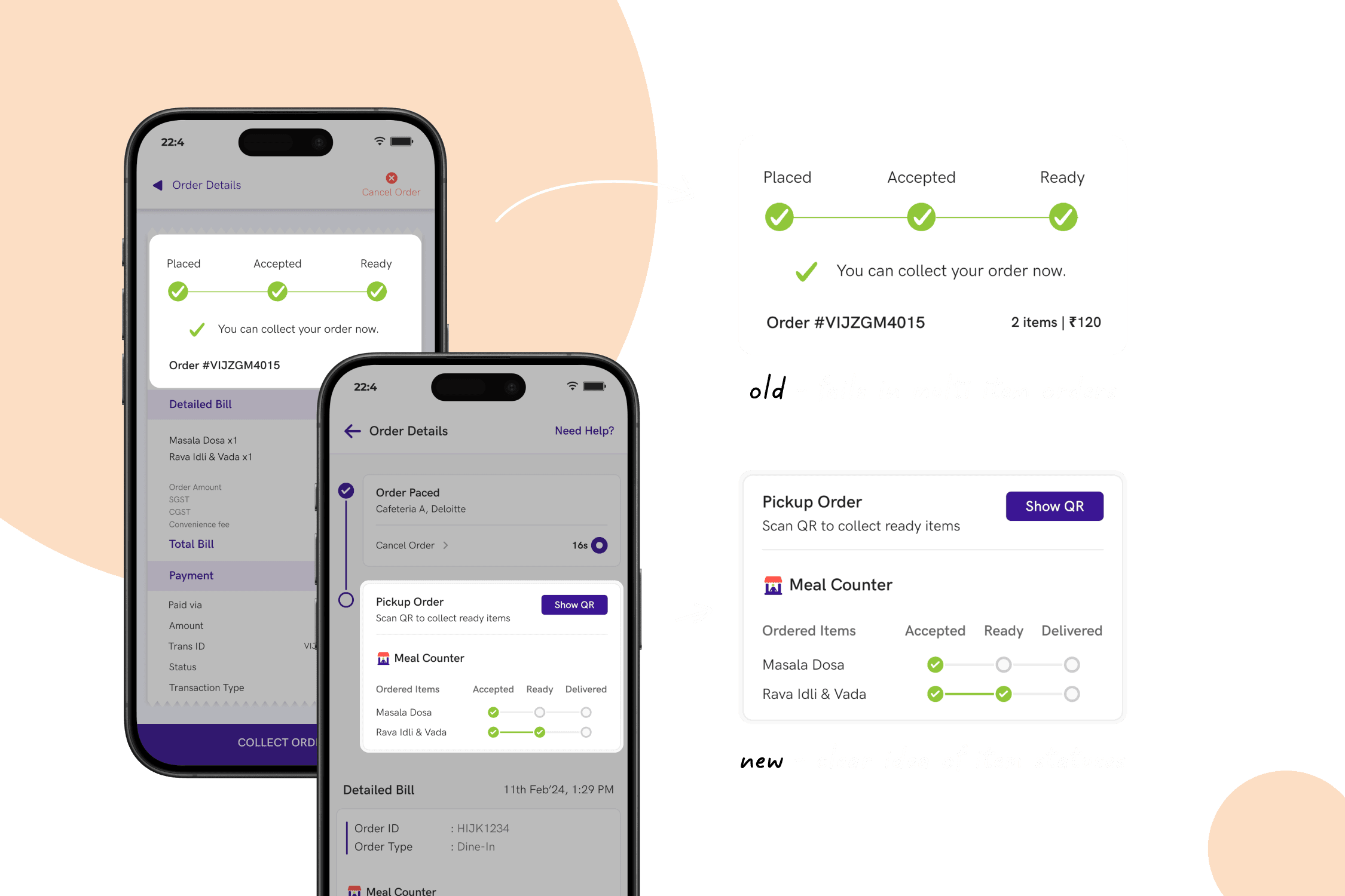
item level order tracking

feedback system overhaul
Act 3:
When everything stopped!
Act 3:
When everything stopped!
COVID hit. Orders dropped from 5+ lakh per day to barely 800. Offices shut down. Cafeterias froze. But we didn’t. I joined forces with cross-functional stakeholders to proactively imagine how HungerBox could stay relevant in a world of distancing, uncertainty, and digital-first behavior. Here’s what we shipped:
Congestion Visibility
QR-based entry/exit scanners fed real-time cafeteria density data.
Slot Booking + Access Flow
Designed full user journeys for entering, eating, and exiting safely - including seat reservations and vendor queues.
Workspace Bookings
Extended cafeteria flows to meeting rooms, gyms, and common areas.
Bluetooth Distancing Alerts
Introduced passive monitoring with real-time feedback dashboards - all with privacy top-of-mind.
The pandemic forced us to rethink faster than ever. Not every feature survived, but it showed how fast we could pivot. It built credibility with clients: HungerBox wasn’t frozen during crisis - we were innovating.

congestion visibilty feature to stay afloat during covid
Act 4:
Gaining Momentum Again
Act 4:
Gaining Momentum Again
When cafeterias reopened, we hit the ground running. I focused on streamlining experiences and enabling new behaviors:
Reordering Funnel
Smart repeat-order flows for daily cafeteria routines
Guest Ordering
Managed both personal and company-sponsored guests - respecting billing rules and roles
Make in India Messaging
Splash screen identity that connected users to our homegrown mission
Each update made the app a little easier to trust, a little easier to return to.

help module along with chatbot integration with zoho

razorpay wallet integration

refund detail visibility
Design Systems, not Design Silos
Design Systems, not Design Silos
With velocity increasing, we needed consistency. I brought in Xordium, our in-house design system, to bring speed and reliability to every screen - especially for our growing PWA footprint.
We even built theming into PWA deployments - 10 core variables for full white-labeling. It turned every client into a custom experience, without the overhead.
This was my bridge between product velocity and engineering scale.
READ MORE
A Smarter Path to Health
A Smarter Path to Health
This wasn’t just about updating an app. It was about rebuilding belief - in a brand, in a product, and in the experience of eating lunch every day.
The biggest thing I brought to the table wasn’t a layout. It was momentum. And at scale, momentum is everything.
This wasn’t just about updating an app. It was about rebuilding belief - in a brand, in a product, and in the experience of eating lunch every day.
The biggest thing I brought to the table wasn’t a layout. It was momentum. And at scale, momentum is everything.
READ MORE
Impact:
From Distrust to Delight
Impact:
From Distrust to Delight
4.2 from 2.3
4.2 from 2.3
app rating jumped
app rating jumped
20+ new corporates
20+ new corporates
during pandemic, client retention improved via safety features
during pandemic, client retention improved via safety features
28% reorder adoption
28% reorder adoption
speeding up daily journeys
speeding up daily journeys
41% avg. CTR
41% avg. CTR
for push notifications
for push notifications
12% decrease
12% decrease
in order to pickup waiting time
in order to pickup waiting time
40% decrease
40% decrease
in support tickets around "where's my food?'
in support tickets around "where's my food?'
What stuck with me
What stuck with me
Redesigning HungerBox’s consumer app taught me that at B2C scale, design isn’t about features - it’s about trust.
This project was proof of maturity: design wasn’t just about polish. It was about building confidence at scale.
Redesigning HungerBox’s consumer app taught me that at B2C scale, design isn’t about features - it’s about trust.
This project was proof of maturity: design wasn’t just about polish. It was about building confidence at scale.
thank you!
keep exploring
thank you!
keep exploring


Bringing ideas
to life,
one product
at a time
Made with 🔥

Bringing ideas to life,
one product at a time
Made with 🔥