Scaling Design beyond Screens
Scaling Design beyond Screens
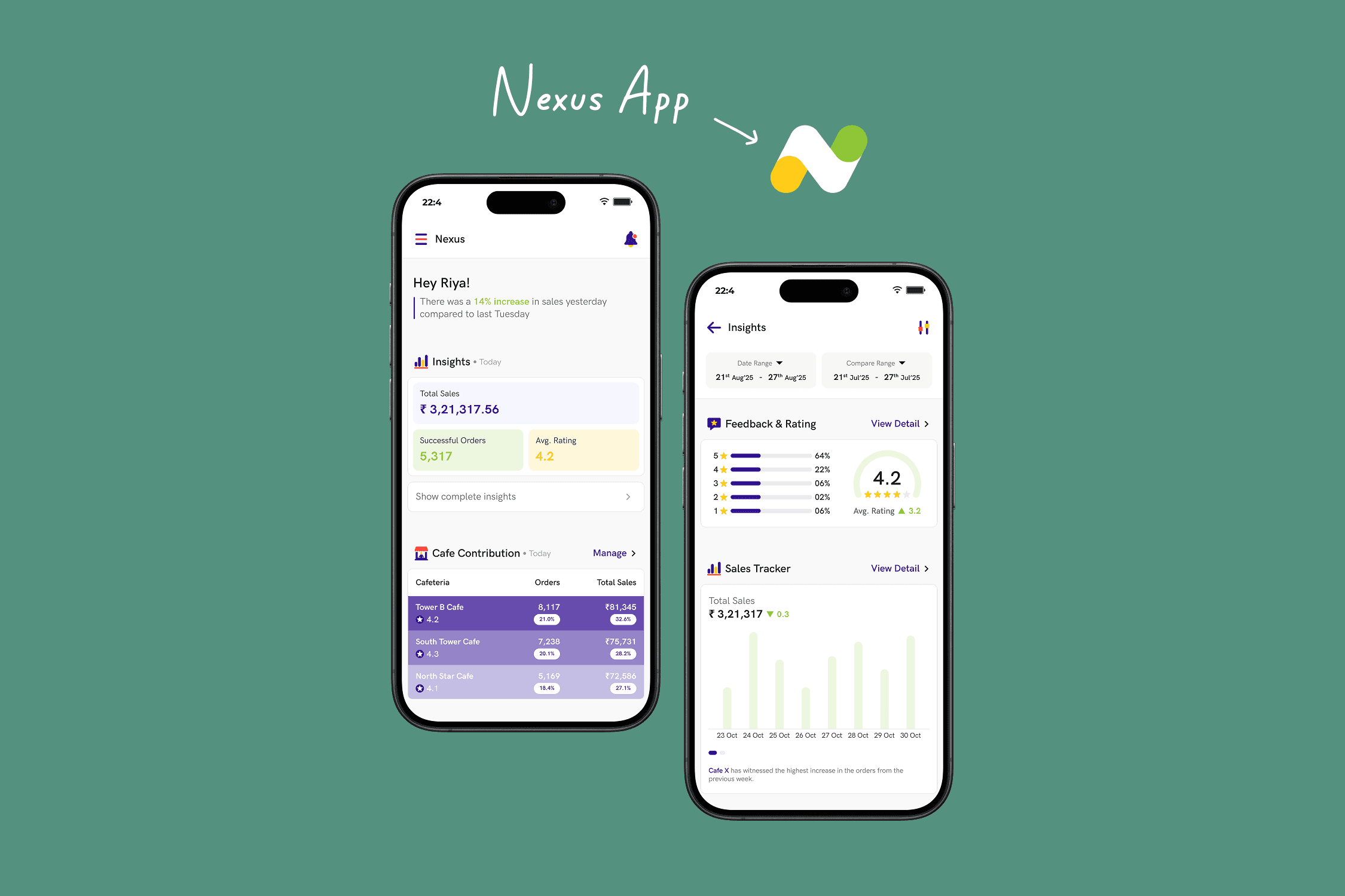
building Xordium, HungerBox's in-house design system
building Xordium, HungerBox's in-house design system

The Brief
The Brief
Xordium is a unified design system to standardize UI, speed delivery, and scale design across all HungerBox products.
Xordium is a unified design system to standardize UI, speed delivery, and scale design across all HungerBox products.
The Challenge
The Challenge
Building a system strong enough to handle millions of daily interactions while cleaning up years of UI drift, tech debt, and fragmented design practices.
The Impact
The Impact
30% faster feature delivery
40% Reduction in design-dev churn
95% Improvement in cross-platform consistency
30% faster feature delivery
40% Reduction in design-dev churn
95% Improvement in cross-platform consistency
When growth turned into Chaos
When growth
turned into Chaos
By 2020, HungerBox was everywhere. We weren’t just an app anymore. We had:
Consumer apps on iOS and Android
Self-ordering kiosks in malls and cafeterias
Admin dashboards for corporates
Vendor POS machines
White-label PWAs for enterprise clients
Each product team was shipping fast. Too fast. Buttons looked different across apps. Colors were inconsistent. Components were coded from scratch in every sprint. Designers were burning out, engineers were duplicating work, and users noticed the subtle cracks in trust.
Our design wasn’t scaling with our business.

The Problem
Beneath UI
The Problem Beneath UI
This wasn’t about aesthetics. It was about efficiency and credibility.
Designers were reinventing the wheel with every new feature.
Engineers spent weeks rewriting identical components for each platform.
PMs couldn’t promise delivery speed with confidence.
Users felt a lack of polish that eroded trust in the brand.

My Role
My Role
I initiated, designed, and led the creation of Xordium - HungerBox’s in-house design system. My responsibilities:
Define foundations (color tokens, typography, spacing, grids)
Create components and patterns tested across platforms
Partner with engineering to align tokens with code
Evangelize adoption across product, ops, and marketing
Govern and evolve the system as HungerBox scaled

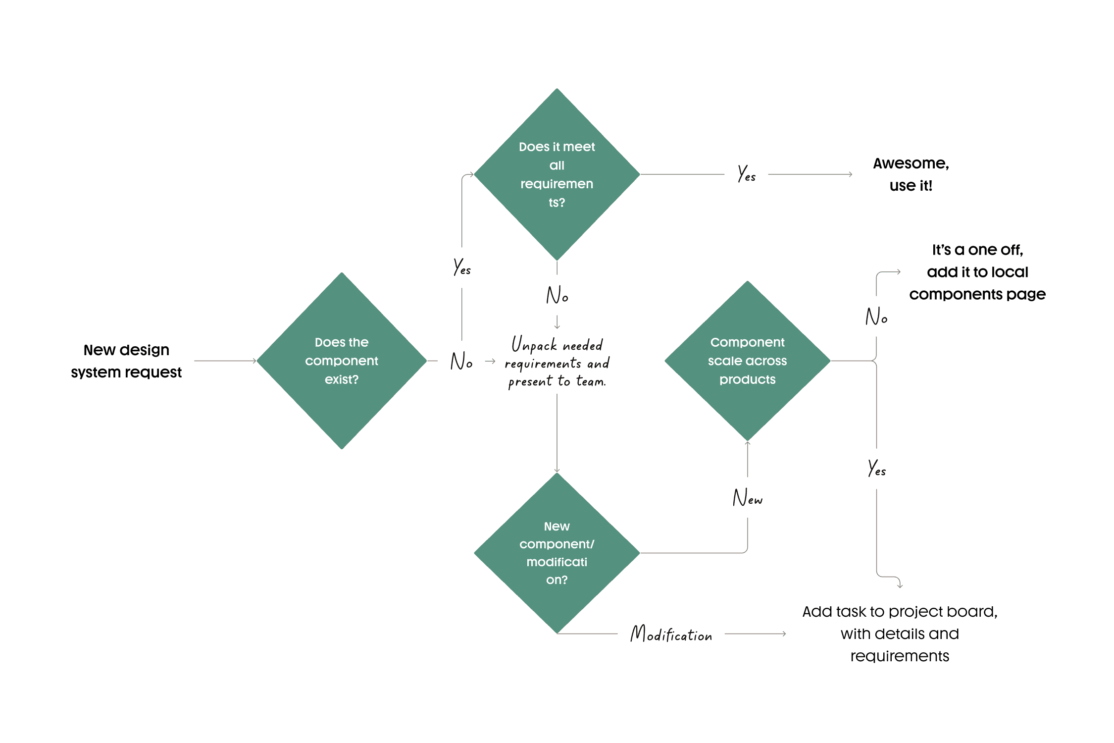
Discovery: Mapping the Mess
Discovery:
Mapping the Mess
Before creating, I audited.
UI audit → catalogued 100+ variations of buttons, forms, and modals across platforms
Interviews with engineers → “Every sprint feels like déjà vu.”
Workshops with designers → mapped pain points in handoffs and consistency
Stakeholder alignment → leadership bought into the long-term ROI of design systems
The findings were clear: inconsistency wasn’t just annoying - it was costing us time, money, and credibility.
We didn't need another style guide,
We didn't need another style guide,
We needed a system!
We needed a system!
Building
Xordium
Building Xordium
We built in layers, not leaps.
1. Foundations
Color palette standardized into tokens
Typographic scale for hierarchy
Grids, spacing, and elevation rules
2. Components
Buttons, inputs, modals, cards, menus
States (hover, active, disabled)
Accessibility baked in from the start
3. Patterns
Ordering flows
Feedback loops
Notifications and error handling
4. Documentation
Living site with Figma libraries + coded components
Usage guidelines with do’s/don’ts

variables in figma
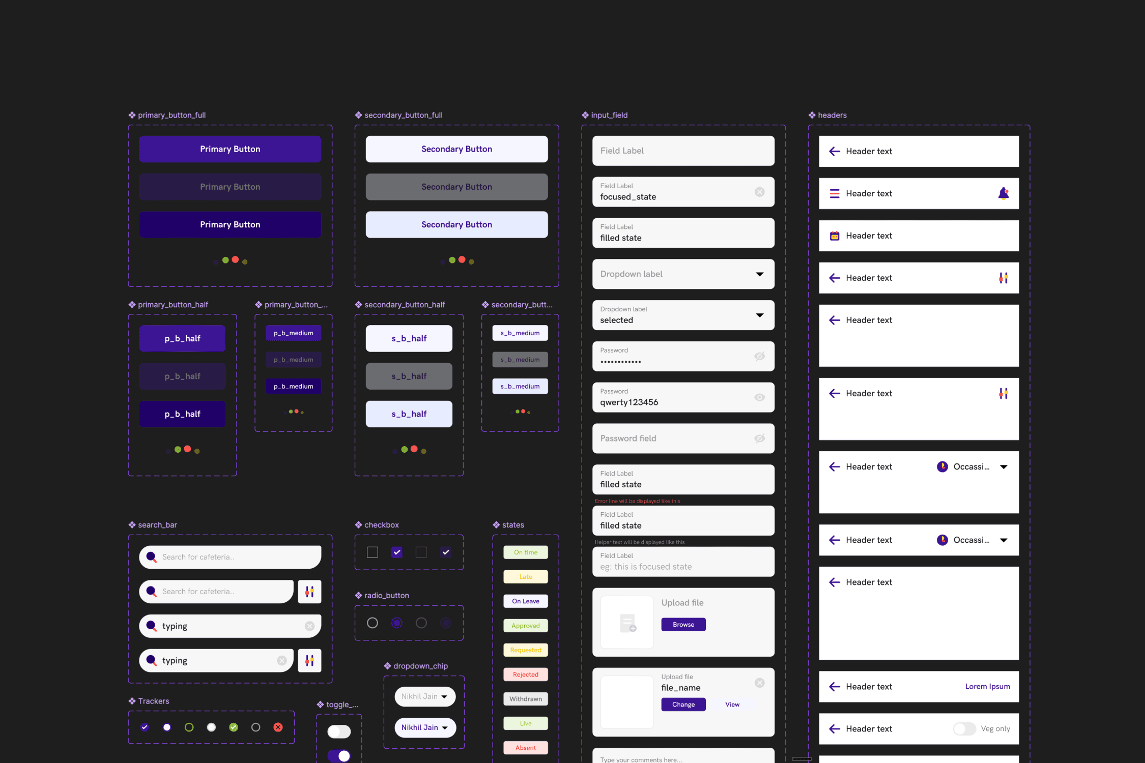
component library

Driving Adoption: More than just design
Driving Adoption: More than just design
A system unused is a system wasted.
Ran training workshops with engineers and designers
Set up design review gates to enforce usage
Partnered with marketing to sync visual identity across campaigns
Created governance process for updates and new requests
Within months, Xordium became the backbone of every HungerBox product.
Challenges
along the way
Challenges
along the way
Engineering skepticism: “This will slow us down.” → Proved ROI by cutting component build time by 30%.
Scope creep: Every team wanted their module standardized immediately. → Prioritized high-use flows first.
Maintenance: Design systems never end. Built a versioning framework to handle evolution gracefully.


Impact of Xordium
Impact of Xordium
30% faster feature delivery
18% higher engagement
thanks to ready-to-use components
thanks to ready-to-use components
5+ platforms
5+ platforms
share consistent design language
share consistent design language
Scalability
Scalability
enabled white-label PWAs by switching 10 color tokens
enabled white-label PWAs by switching 10 color tokens
Design-to-dev churn
Design-to-dev churn
reduced, fewer back & forth, faster QA
reduced, fewer back & forth, faster QA
Trust
Trust
UX complaints around inconsistency dropped significantly
UX complaints around inconsistency dropped significantly
Before Xordium, every sprint started from scratch
Before Xordium, every sprint started from scratch
Now it feels like building, not firefighting
Now it feels like building, not firefighting
Reflection:
Designing Culture, not just components
Reflection:
Designing Culture,
not just components
Xordium wasn’t just a library of buttons. It was a cultural shift.
I learned that design systems succeed only when they bridge design, engineering, and product. They’re not about pixels - they’re about people aligning around shared principles.
For HungerBox, Xordium turned scattered products into a family. For me, it was proof that the best design work often isn’t visible to users - but it shapes every experience they touch.
thank you!
keep exploring
thank you!
keep exploring

Bringing ideas
to life,
one product
at a time
Made with 🔥

Bringing ideas to life,
one product at a time
Made with 🔥