The HungerBox Glow-Up
The HungerBox Glow-Up
from a scrappy startup look into a confident enterprise entity
from a scrappy startup look into a confident enterprise entity


The Brief
The Brief
Rebranding HungerBox from a scrappy orange startup into a bold, enterprise-grade brand that finally matched our scale.
Rebranding HungerBox from a scrappy orange startup into a bold, enterprise-grade brand that finally matched our scale.
The Challenge
The Challenge
An outdated identity was hurting trust, consistency, and perception across millions of users and Fortune-500 clients.
An outdated identity was hurting trust, consistency, and perception across millions of users and Fortune-500 clients.
The Impact
The Impact
A unified purple identity that lifted conversions by 10%, strengthened enterprise trust, and set the foundation for a 2.3 to 4.2 app rating
A unified purple identity that lifted conversions by 10%, strengthened enterprise trust, and set the foundation for a 2.3 to 4.2 app rating
The Startup look that overstayed its welcome
The Startup look that overstayed its welcome
When HungerBox launched in 2016, branding took a backseat. The goal was straightforward: acquire clients, onboard vendors, and survive. A basic orange logo and mismatched app screens sufficed for early success.
By 2019, however, HungerBox had evolved into India’s top cafeteria-tech platform, processing millions of orders daily for global enterprises. Yet, the brand still appeared unpolished, lacking trust, pride, and a clear identity.
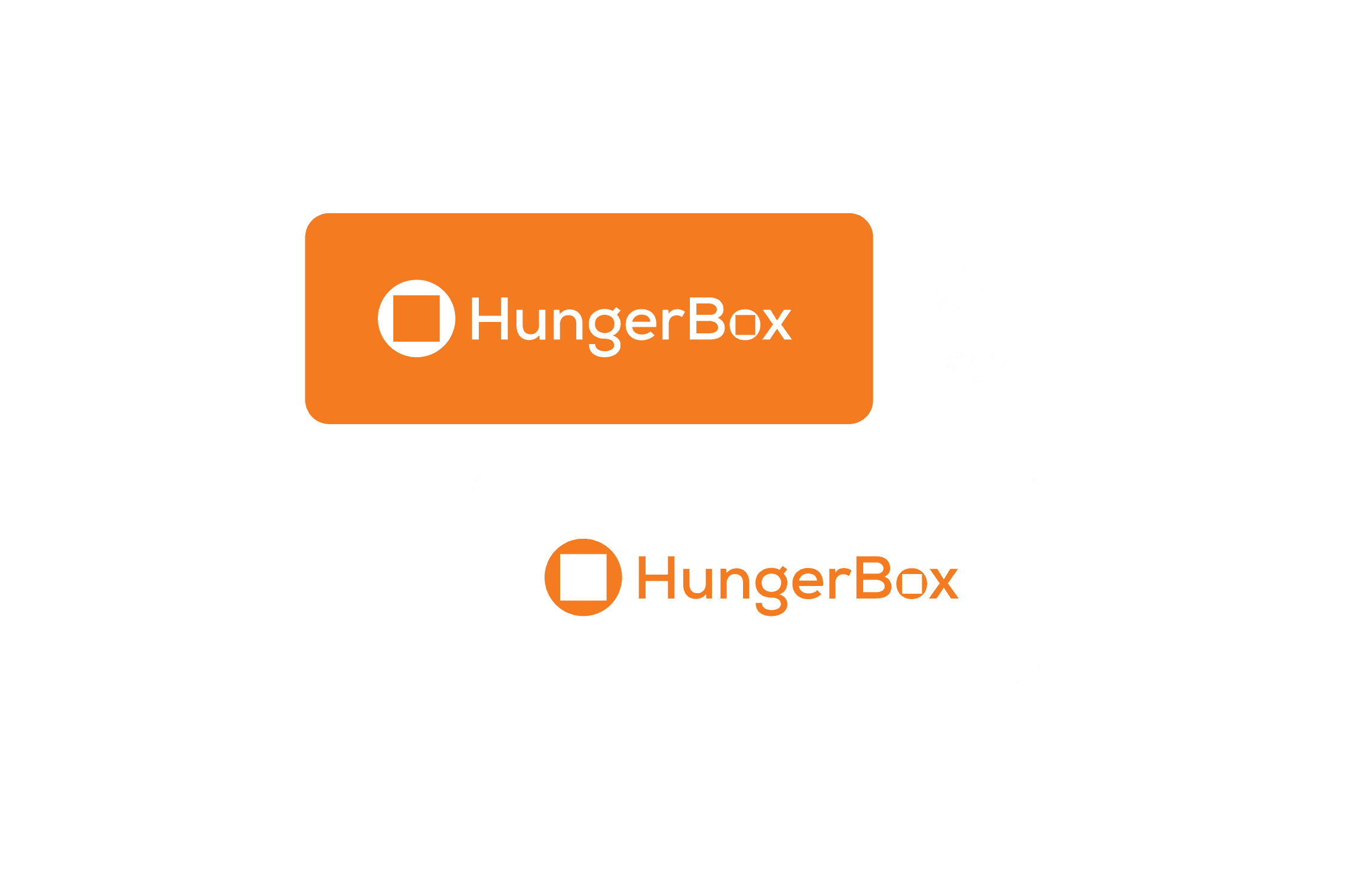


inconsistent branding across system
What wasn't
working
What wasn't
working
Clients saw us as operationally strong, but visually immature.
Logo lacked character and memorability
UI across platforms was inconsistent and dated
Brand had no story, cohesion, or trust factor
Touchpoints felt transactional, not human
We were scaling despite design, not because of it. And at scale, that’s dangerous.
My Role
My Role
I was tasked with leading HungerBox’s first rebranding effort. My responsibility went beyond design - it was about creating an identity that aligned with our business ambitions. That meant:
Working cross-functionally with marketing, product, engineering, and leadership
Partnering with a digital agency for creative exploration
Ensuring the rebrand didn’t stop at the logo but lived across every touchpoint

Discovery: Who we are, really?
Discovery: Who we are, really?
We started with one question: “What should HungerBox stand for in the next decade?”
Our process:
Workshops with leadership → to map vision and values
Employee surveys → to understand internal pride and culture
Competitor analysis → studying Indian + global food-tech brands
Moodboards → exploring cues from fintech and SaaS brands that conveyed scale and trust
What emerged were three brand pillars:
Bold → stand out in a crowded market
Trusted → reflect enterprise-grade reliability
Modern → match the digital-first cafeteria experience


Bold
Bold
Trusted
Trusted
Modern
Modern
who we are? really
The Purple
Revolution
The Purple
Revolution
The breakthrough came with color. We chose purple - rare in food-tech, instantly distinctive, and psychologically powerful.
Blue’s trust + Red’s energy = Purple confidence
A fresh logo symbolizing motion and growth
Modern typography to unify voice across platforms
This wasn’t just a rebrand. It was a repositioning: HungerBox was no longer a scrappy vendor manager. It was a bold enterprise partner.


new revolutionary purple branding
Rolling it out,
Accross Ecosystem
Rolling it out,
Accross Ecosystem
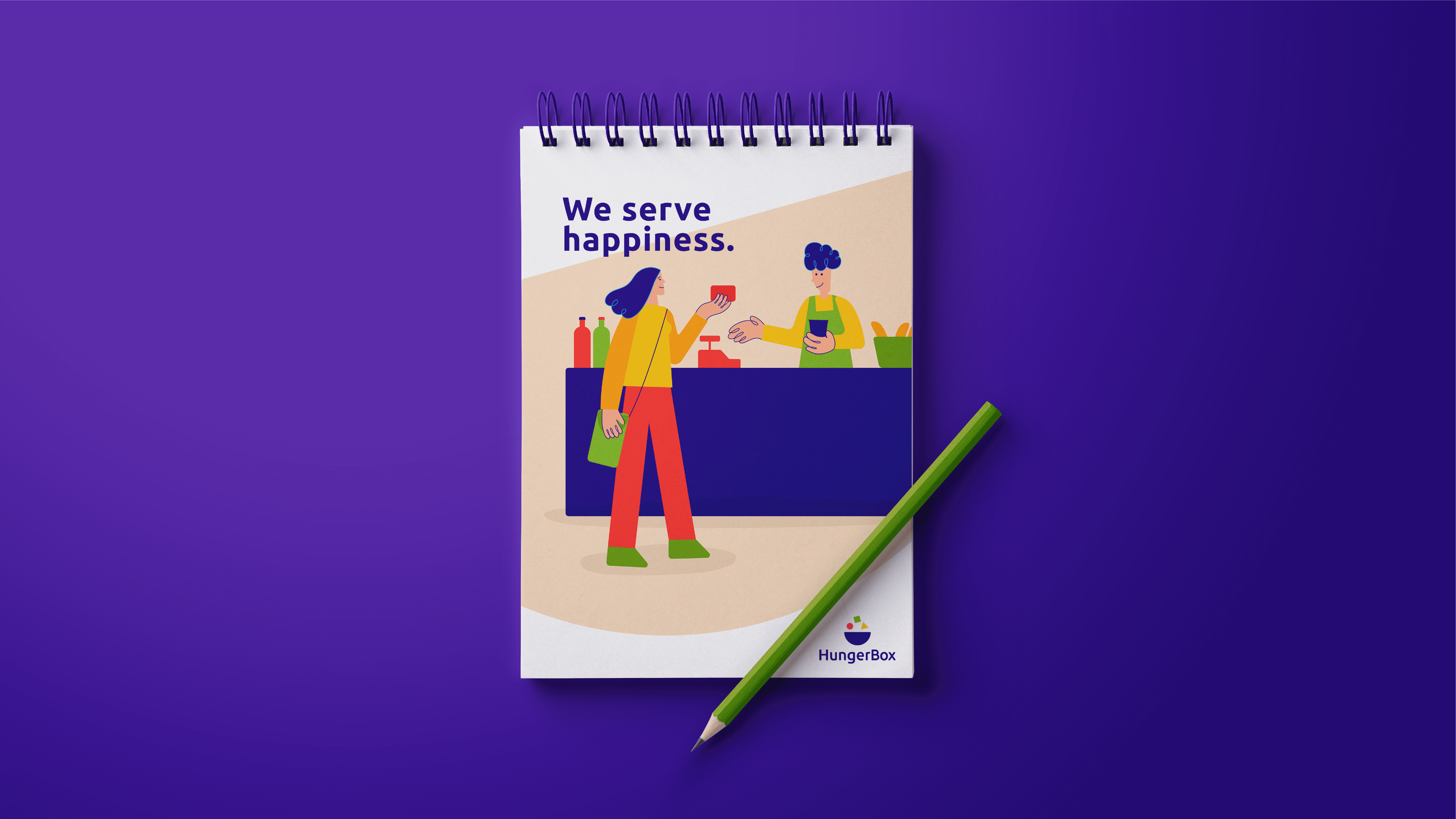
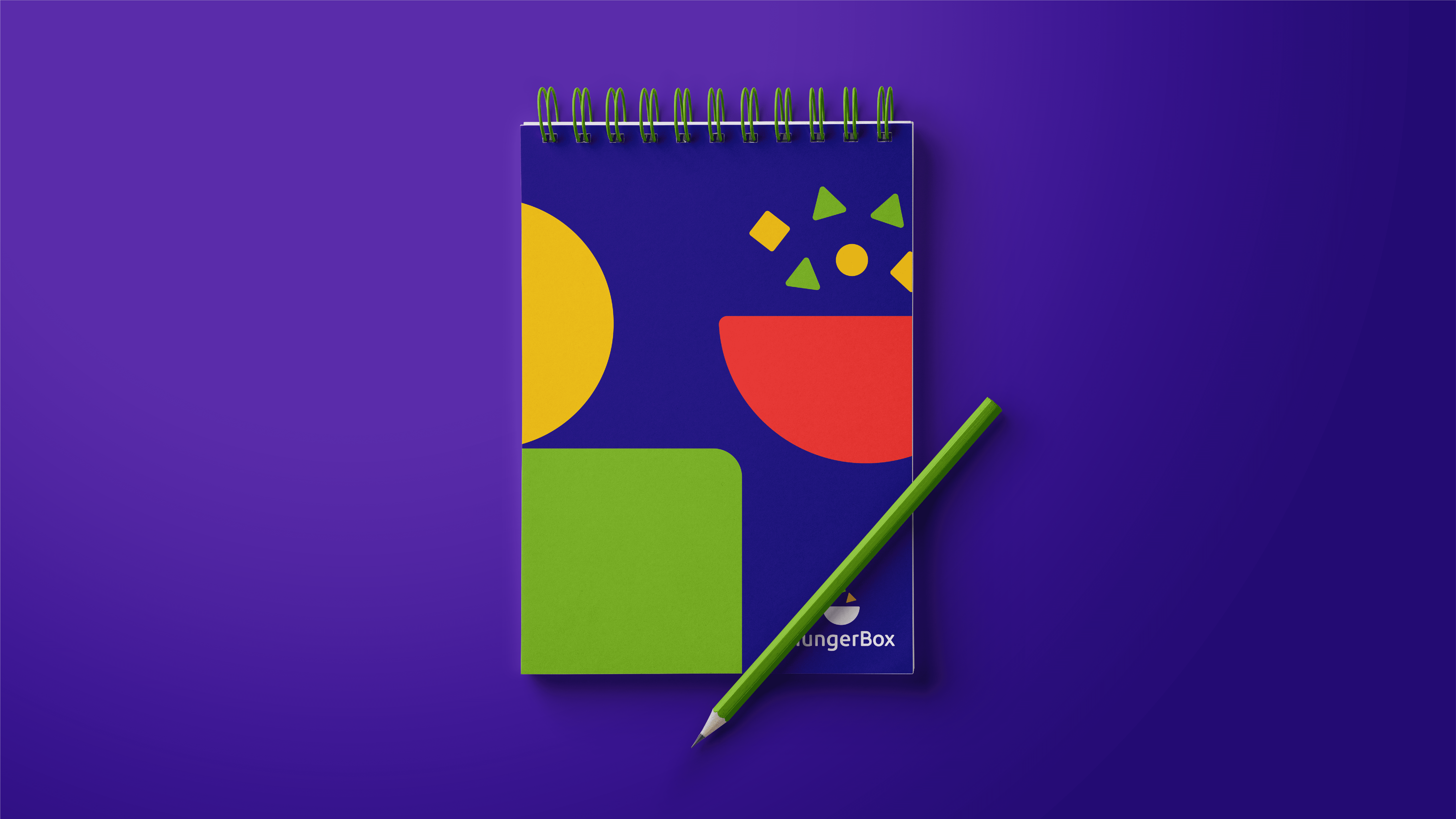
A logo without rollout is just art. My job was to bring the new brand alive everywhere:
Consumer App → redesigned with purple UI, kicking off what users called the “Purple Revolution”
Website → redesigned flows boosted conversions by 10%
Self-Ordering Kiosks → aligned physical experiences with digital identity
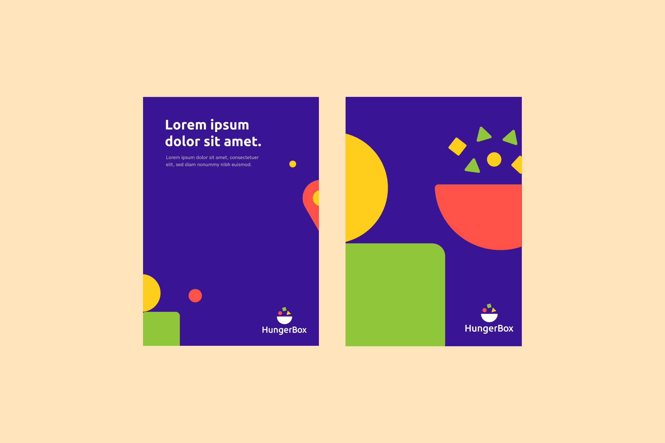
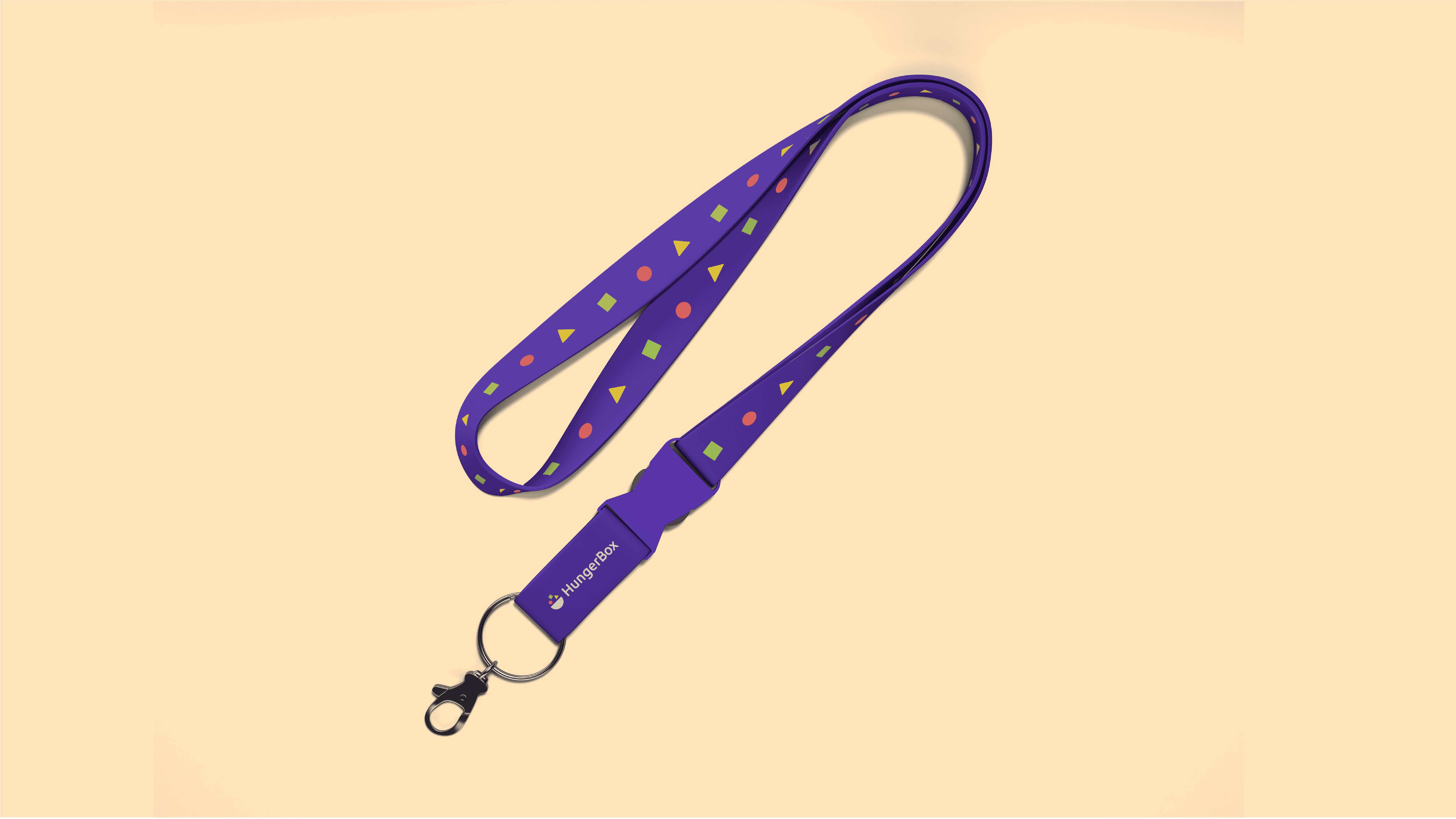
Internal Assets → marketing decks, HR templates, and event branding for consistency
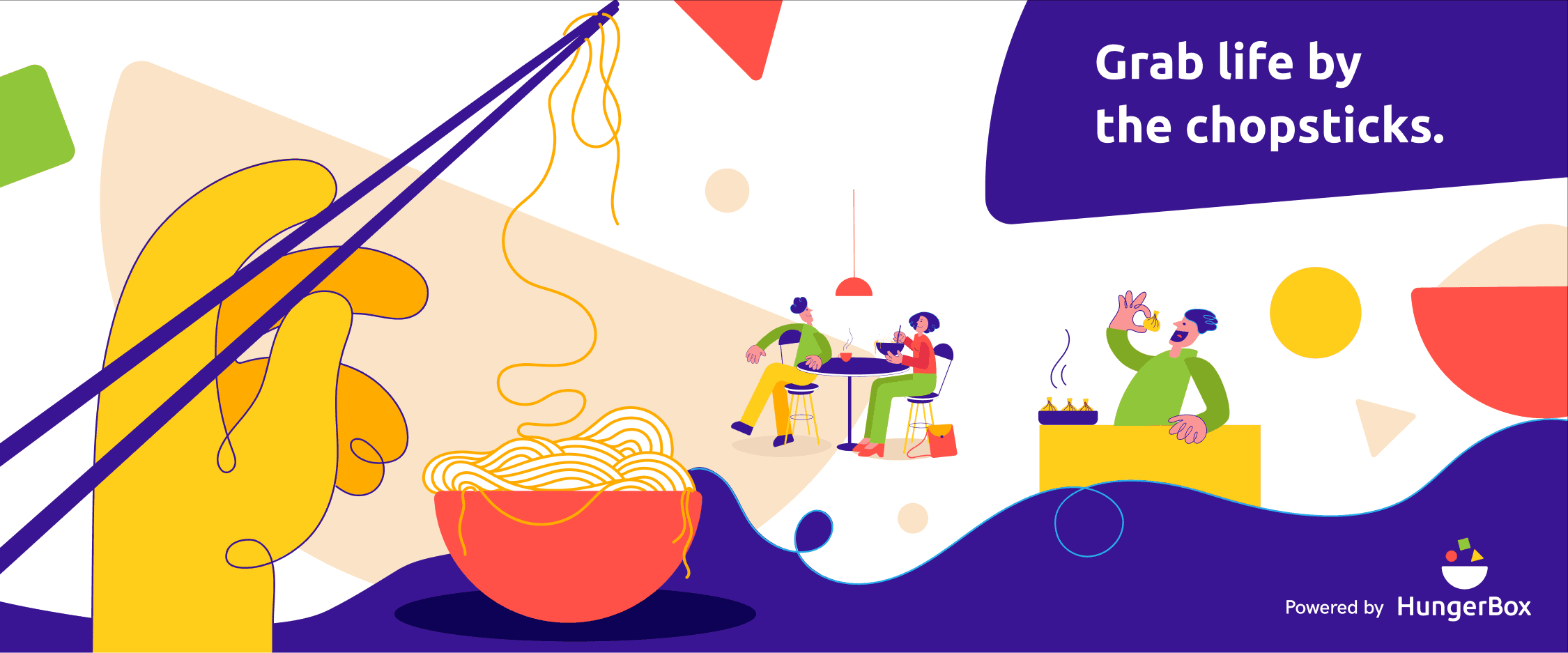
Every touchpoint told the same story: HungerBox is bold, modern, and trustworthy.


AI scans the plate, detects food items & gives detailed nutritional info
Challenges on the way
Challenges on the way
Engineering skepticism: “Why spend sprints on color?” → Solved by introducing brand tokens into the codebase.
Leadership doubts: “Is purple too risky?” → Backed decisions with psychology + competitive differentiation.
Consistency marathon: With so many products, rollout risked fragmentation → built checklists and a governance framework.
Tangible
Impact
Tangible Impact
17% boost
17% boost
in app engagement within first quarter
in app engagement within first quarter
40% decrease
40% decrease
in design related support tickets
in design related support tickets
3x increase
3x increase
in usage of sales deck & collaterals
in usage of sales deck & collaterals
We always trusted your service,
We always trusted your service,
Now your brand reflects that trust!
Now your brand reflects that trust!
Reflection: Branding beyond Aesthetics
Reflection: Branding beyond Aesthetics
This project taught me that branding isn’t decoration. It’s a business strategy.
A bold color, a confident logo, and a consistent rollout shifted how clients saw us, how employees felt about us, and how users interacted with us.
For me, it was also personal: it was my first time leading a company-wide identity change. I learned to balance creativity with strategy, negotiate with skeptics, and push design from execution to vision.
thank you!
keep exploring
thank you!
keep exploring

Bringing ideas
to life,
one product
at a time
Made with 🔥
Bringing ideas to life,
one product at a time
Made with 🔥
